Sunday, 26 October 2014

Kevyn Aucoin


http://ww4.hdnux.com/photos/10/36/72/2223787/5/628x471.jpg
Kevyn Aucoin

Kevyn Aucoin is considered the world’s first celebrity make-up artist and there are three bestselling books that he had written and they are The Art of Makeup, Making Faces and Face Forward. He was awarded a CFDA Award from the Council of Fashion Designers of America in 1994 and he remains the only makeup artist who have received the honour. He worked with magazine cover models and celebrities including Janet Jackson, Cher and Gwyneth Paltrow,e tc.The Kevyn Aucoin Beauty brand is a makeup brand which Kevyn Aucoin founded and launched in 2001. Aucoin passed away in 2002 due to complications arising from his condition and this news shocked the whole fashion industry.
Editorial collage of Kevyn Aucoin's work
http://www.anothermag.com/current/view/4039/Remembering_Kevyn_Aucoin
Editorial Collage of Kevyn Aucoin's work
https://c2.staticflickr.com/4/3172/2639489755_40a86b94c1.jpg
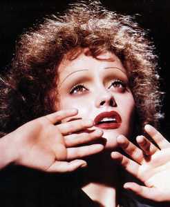
Christina Ricci as Edith Piaf in Kevyn Aucoin's book 'Face Forward'
The makeup look from above reminds me of the Elizabethans because of the thin eyebrows, pale skin, rouged lips and the curly frizzy hair. I like the way how the lights and shadows shown on the face and also how the black background and the black shirt makes Christina Ricci's face and the makeup more stand out and focus on the image.

Kevyn Aucoin's brand website: http://kevynaucoin.com/products

Saturday, 25 October 2014

London trip- Favourite Portrait from the National Portrait Gallery


Queen Elizabeth I, associated with Nicholas Hilliard, circa 1575 - NPG 190 - © National Portrait Gallery, London
http://www.npg.org.uk/collections/search/portrait/mw02074/Queen-Elizabeth-I?LinkID=mp01452&search=sas&sText=elizabeth&OConly=true&wPage=0&role=sit&rNo=4
Queen Elizabeth I
associated with Nicholas Hilliard
oil on panel, circa 1575
31 in. x 24 in. (787 mm x 610 mm)
Purchased, 1865

I have chosen the portrait from above as my favourite from the National Portrait Gallery and it is a portrait of Queen Elizabeth I. The reason I choose it is because I like how details the gown was drawn on this portrait and also the way Elizabeth posed confidently which shows her powerful role within this portrait and also shows the strength that Elizabeth held during her reign. The portrait is filled with the colour black, red, pearly white, copper and shades of gold which are the important colours in Elizabethan era for the Upper class to show their nobility. The plain dark red background stands out Elizabeth's costume and this portrait emphasise and make focuses on the rich costume and jewelleries. The jewel on Elizabeth's chest is a phoenix and this unique bird, mythical, reborn out of fire suggest to the unmarried Queen Elizabeth's virginity and rebirth.
I like how the gown is completely covered in gold embroidery and pearls which symbolised purity and nobility and the puffs on the gown helps to accentuate more the breadth of the shoulders and the slender waist. The white pale face, strawberry blonde curly hair, rouged cheeks and lips and the thin eyebrows were all visible on this portrait. In the portrait, Elizabeth holds a Tudor rose which was used to refer to the Tudor dynasty and the unity that it bought to the realm. The rose also related to religious connotations as the medieval symbol of the Virgin Mary I.

Friday, 24 October 2014

Contemporary Portrait that presents wealth

2NE1 CL wore designs by Jeremy Scott for 'Ketchup' magazine on December 2012.

http://www.dramafever.com/news/2ne1s-cl-poses-in-jeremy-scott-for-ketchup-magazine-cover/?replytocom=442887

I have chosen the photo above of CL on the 'Ketchup' magazine cover to demonstrate wealth. I think it is a very good example to present wealth because of how it features many bold accessories such as gold chain, matching with gold earrings, sunglasses, claw ring and the gold blonde hair. Especially the use of the colour scheme gold, it helps to present wealth as gold is the colour of luxury, quality and value. Also, the psychology of colour gold implies material wealth, affluence and extravagance. The gold flourish silk bomber jacket and the scarf print dress that Jeremy Scott design symbolised wealth as silk is a expensive material and also how the scarf print dress have got some gold chain patterns on it. The pose of CL look confident and sassy on the cover and the pale skin, bright red lips are very eye-catching which symbolise power and confidence as well.


Tuesday, 21 October 2014

Monochromatic colour makeup (Purple)

Equipments:
  • Cleanser, toner, moisturizer
  • Cotton pads
  • Cotton buds
  • Foundation Palette
  • Matte primer
  • Concealer
  • Loose powder
  • Highlighter palette
  • Eyeshadow palette
  • Kryolan Supracolor palette
  • A puff
  • Foundation brush
  • Concelaer brush
  • Powder brush
 
Model: Mireia Loor

For this monochromatic look, I have mainly used the colour purple as the theme. I personally like the colour of the purple lips and how the makeup look got a soft texture. In order to improve next time, I can add more tones to the makeup to make it more expressive.

Monday, 20 October 2014

Symbolism - Self portrait

On below, I have asked my friend to take a photo of me which symbolise things about me.
 
 
This portrait is like a description of myself now and also things I like to do in my spare time. The reason I choose the library as the location I want to take my photo is because I'm a person who likes to work in a quiet place without any disturb. The reason I edited the photo into a beauty and fantasy effect is because I like designing and use my creativity to design new things. In my spare time, Im interested in watching beauty and makeup tutorials on Youtube, so I have included a computer in the photo with some makeup channels on the screen.
The shopping bag and the coat on the table show that I like to go shopping and especially buying clothes. The bag is from the River Island because it is my favourite place of buying clothes and accessories. The reason I was smiling in the photo is because I'm a positive person, I enjoy what I'm doing and I'm happy about my life.
 In the photo, I was holding a pen and looks like I'm designing things. And yes, I like designing and drawing. Before I go to university, I did A-levels Fine art, Graphic art and Fashion. I enjoy the time when I was studying A-levels with my friends at sixth form. The notebook that I was writing on is one of the thing that I'm currently using most of the times. It is very important to me because I have made notes from the lesson I did at uni and I have also written down many design ideas as well.

Sunday, 19 October 2014

Extreme Contouring

Equipments:
  • Kryolan Supracolor palette
  • Eyeshadow palette
  • Loose Powder
  • Concealer brush
  • Matte primer
  • Foundation brush
  • Eyeshadow brush
  • Highlighter brush
  • A puff


Before and after photos:


The extreme contouring workshop is very interesting as we have learnt how to use two colours to create and extreme and contrast colours look. For my colour contouring, I decided to focus on the highlighting and shading areas. This look related to the colour theory as it shows the visual effects of a specific colour combination. On above is my experimentation of extreme contouring.

The Colour Theory

The colour theory is like a practical guildence for people who experiment with mixing different colours and it is very important for a makeup artist by understanding how colours can effect one another. The visual effects of colours can be described through lightness, hue and saturation. Colour context is how colour react with other colours and shapes.
Primary colours are the basis of all colours and they are yellow, blue and red. While secondary colours are the combination of the primary colours such as the colours orange, purple and green.
The colour wheel shows the relationships between primary colours, secondary colours and tertiary colours, etc. Around the circle diagram, it presents the shades of different colours and also the relationships between the colours.


The colour wheel
  • Analogous colours - Similar colours on the colour wheel (e.g. yellow, orange and brown)
  • Complementary colours - Contrast colours (e.g. red and green)
  • Achromatic & neutral colours - white, black and grey
  • Chromatic colours -  the actual colours
  • Monochromatic- one colour and one shade (darkest to lightest)
  • Cool & warm colours - Cool colours range from purple to green, warm colours range from red to yellow

    I have done 4 examples on below:Achromatic colours look
    
    Black and grey
    
    Model: Sera Gerwat


    Complementary colours look
    
    Green and red


    Monochromatic colours look
    Purple


    Analogous colours look
    Yellow, orange and brown