Friday 31 October 2014

Doing basic drawings in lesson


On Monday's lesson, we have a drawing session with Kat Vogart and we have learnt how to draw lines without using a ruler and also how to hold the pencil properly when drawing or sketching (holding the top of the pencil and moving the arm instead of moving the wrist).
On this page, I have tried to draw straight lines horizontally, vertically and across the page. I found the hardest one is to draw across the page (-.-')
After that, I have drawn different shapes (circles, squares and triangles) without a ruler.
Then on the next page, on the left, I have shown the different shades and tones of the sketching pencil ranged from 6B to 2H. After that, I have drawn different forms and I have considered the light and shadows when I was drawing them. On the bottom left corner, I have drawn a cone and this time, I have added more details and tones to it to make it more three dimensional and realistic.

When I was at home, I practiced the techniques that I've learnt from Kat's lesson by drawing a mug and consider the lightings, shadows and also using different line patterns.
http://beta.copicmarker.com/wp-content/uploads/2010/12/hatching+cross.jpg

Tuesday 28 October 2014

Kara 'Damaged Lady' music video and album photos

Kara is a Korean girl group and on below is their music video 'Damaged Lady' from Youtube. I found all five of the members makeup looks very eye-catching and I like how each of them have different makeup looks, costumes and styles which make their looks more unique and fascinating.


The ideas of their styles are inspired by the 'Queens' where the 5 members can be seen wearing tiaras and royal attire.
 
http://www.kpopstarz.com/articles/39332/20130828/kara-releases-second-teaser-video-for-damaged-lady.htm


http://minakminak.blogspot.co.uk/2013/09/kara-mv-damaged-lady.html
Photos from Kara's forth Korean studio album 'Full Bloom'


Queen Elizabeth, c.1575.
http://www.luminarium.org/renlit/elizanglesey.jpg
Queen Elizabeth, c.1575-1578.
Attr. to Nicholas Hilliard.
Anglesey Abbey.
 The costumes from Kara's 'Damaged Lady' music video and album reminds me of one of the Queen Elizabeth I's portrait which is the portrait from above. The use of gold, black, white and red from Kara's costumes links to the colours used on Elizabeth's costumes and the Tudor rose that she was holding in the portrait. White and black were Elizabeth's favourite colours as they symbolised virginity and purity.
 
On below is one of the photos of Jiyoung and pearls are used on her earrings. In Elizabethan era, pearls symbolised purity and it is one of the most popular jewelry for upper class fashionable women at that time. 

Halloween Makeup

In class, we were given three skull makeup looks and I have chosen the makeup look from below and recreate it with my creativity. The reason I choose this makeup look is because I like how the red colours from the face was faded out to create a more dimensional and scary look.
 
Model: Mireia Lopez
 
 
To improve this makeup look next time, I will balance the shape on the eyes more and also draw the stitching on the lips more evenly and in details and I will put more red on the lips as well. I do like the effects I've done on the neck which goes from red and then faded out with the white colour. I also like how  I've used purple on the eye area and used black to contour the areas which gives more depth to the eyes and helps the eye makeup to look more three dimensional.

On above is the makeup that Mireia did on my face during the lesson.

Monday 27 October 2014

The Seven Photographs that Changed Fashion

'Seven Photographs that Changed Fashion’ is about a photographer called Rankin, a British photographer who was recreating seven iconic images with his own style. In the film, Rankin shows us the seven artists that he thought changed the fashion industry and also  looking back the history of fashion. The artists that Rankin used were Cecil Beaton, Erwin Blumenfeld, Richard Avedon, David Bailey, Helmut Newton, Guy Bourdin and Herb Ritts.

 1. Cecil Beaton
 
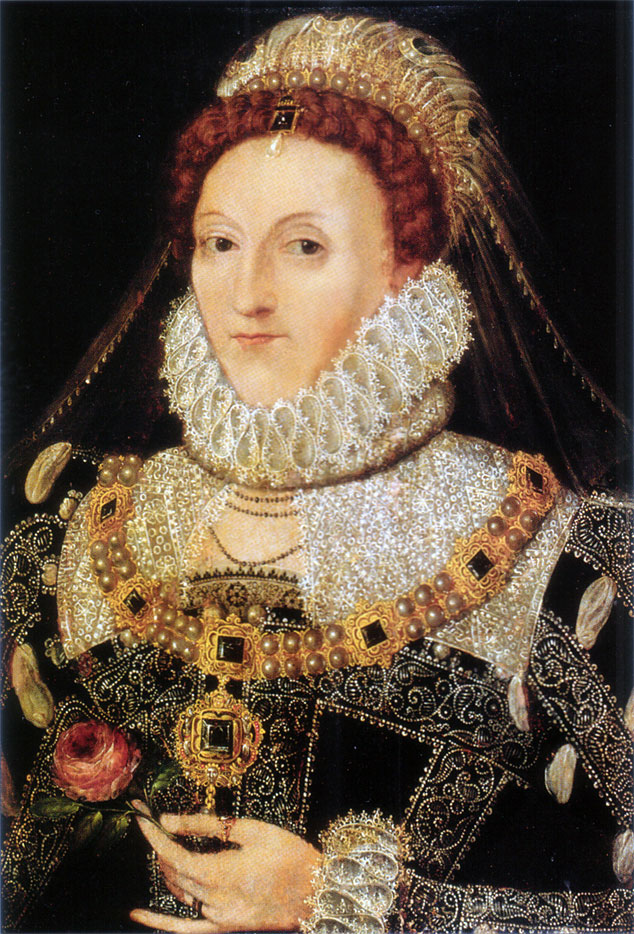
Cecil Beaton was an English fashion, portrait and war photographer (1904-1980).


The original image on the right 'Hat box' created on 1934 with the model Elsa Schiaparelli in the photo. In the film, Rankin recreated this image with the artist/ model Sophie Ellis Bexter
Rankin recreated this image with Artist/Model Sophie Ellis-Bexter by using a digital camera. The original photo was taken with a 10 by 8 camera which shows the image upside down so it was more difficult to capture an image with that camera. I personally think Rankin has done a great job here because I like the way the model positions the same as the original image but it shows a different mood within the photograph.

2. Erwin Blumenfeld
 
Erwin Blumenfeld was a Germany photographer and artist (1897-1969) and he was best known for his fashion photography published in Vogue and Harper's Bazaar in the 1940s and 1950s.


The original image is a Vogue cover in 1950 with the model Jean Patchett. In the film, Rankin had got Heidi Klum to recreate the original Vogue cover image. In 1950, Photoshop was not invented yet so at that time, Blumenfeld erased majority of the image just leaving the eye, eyebrow, lips and beauty spot then the bright colours they used for the makeup look had to be painted on the photo afterwards. I prefer the original image more because the colours are more sharper and stronger although the whole face isn't appear on the image.


3. Richard Avedon
 
Richard Avedon was an American fashion and portrait photographer (1923-2004).


The original image was called ' Dovima with Elephants' with the model Dorothy Horan (Dovima) in 1955. Rankin recreated the image on the left  with the model Erin O'Conner. I like Rankin's photo because of how the colours are bold and also comparing with the original image, Dovimas body is more relaxed than Erin's posing.
 
4. David Bailey
 
David Bailey is an English fashion and portrait photographer who was born in 1938.


The image on the left was taken by David Bailey with his previous lovers Jean Shrimpton in 1963. Rankin recreated this image with his girlfriend Tuuli. In the original image, Jean's jaw line is very apparent and the whole photo was captured beautifully. I like the lighting on the photo that Rankin recreated and also Tuuli's hair add a more stylish and modern effects to the photo.
 
 5. Helmut Newton
 
Helmut Newton was a German- Australian photographer (1920-2004).


The image on the left was taken by Helmut Newton for the Fench Vogue in 1975 with the model Rue Abriot. I like the layout of the photo and the way Newton has created depth of field within the photo. Rankin recreated this image and I think he did very well because the model has got a similar posing but the street looks more modern which makes Rankin's photograph more unique. Comparing to the original photo, Rankin's model posing doesn't look as natural as the original one as the models hands and the facial expression are not shown naturally.
 
 6. Guy Bourdin
 
Guy Bourdin was a French fashion photographer (1928-1991).


The image on the top was created by Guy Bourdin in 1970 and Rankin recreated the iconic look with the model Daphne Guinness and with a similar pose captured in the photo. The lighting in Rankin's photo looks sharper than the original image and I like how Rankin uses red tights to sharpen the image and make it more eye-catching.
 
 7. Herb Ritts
 
Herb Ritts was an American fashion photographer who concentrated on black and white photography and portraits and his style of photographs are often inspired by the Greek sculpture.


'Fred with tyres' on the left was created in 1984 and Rankin recreated the image with the model David Grandy on the right. Rankin's photo looks very natural as he caught David actually at work. I like the black and white tones that Rankin has used on the photo which makes the photo look more powerful. 

Sunday 26 October 2014

Contemorary Elizabethan Look - Kim TaeYeon in SNSD 'The Boys' Music Video

Girls Generation (SNSD) 'The Boys' music video

http://images5.fanpop.com/image/photos/27000000/Taeyeon-The-Boys-mv-s-E2-99-A5neism-27080548-1920-1080.jpg
Kim Taeyeon
Kim Taeyeon is one of the members in a Korean girl group call Girls Generation (SNSD) and Taeyeon's look on 'The boys' music video in 2011 reminds me of the Elizabethans. Byung Ok Seo, Gang Mi Kim, Hyun Jung Ryu, Ji Young Lee and Soonsoo Kyoung Mee Shin are responsible for the makeup. Soo Koung Suh is the stylist and Ji Young Choi, Soonsoo a Reum Kim, Yoo Da Soonsoo Heewon and Young En Kweon are the hair stylist of this music video.
For me, the design of the makeup looks like a modern interpretation of the Elizabethan makeup. Although the eyebrows and the lip colour doesn't fit in the ideal beauty of the Elizabethans which is thin, arched eyebrows and rouged lips but the pale complexion, red cheeks that Taeyeon wore in the music video reminds me of the ideal beauty that Elizabethan women thought of. I like the eyeshadows that Taeyeon wore and it has got the colour gold which also links to the Elizabethans because gold colour were only worn by the highest nobility in the land. The dress and the hair accessories are focused on the colour gold and white and pearls are used on the hair accessories that Taeyeon wore. Pearls were used to represent virginity and purity in the Elizabethan era.The middle parting and the frizzy curly hair is one of the features of the Elizabethan women as well.

Kevyn Aucoin


http://ww4.hdnux.com/photos/10/36/72/2223787/5/628x471.jpg
Kevyn Aucoin

Kevyn Aucoin is considered the world’s first celebrity make-up artist and there are three bestselling books that he had written and they are The Art of Makeup, Making Faces and Face Forward. He was awarded a CFDA Award from the Council of Fashion Designers of America in 1994 and he remains the only makeup artist who have received the honour. He worked with magazine cover models and celebrities including Janet Jackson, Cher and Gwyneth Paltrow,e tc.The Kevyn Aucoin Beauty brand is a makeup brand which Kevyn Aucoin founded and launched in 2001. Aucoin passed away in 2002 due to complications arising from his condition and this news shocked the whole fashion industry.
Editorial collage of Kevyn Aucoin's work
http://www.anothermag.com/current/view/4039/Remembering_Kevyn_Aucoin
Editorial Collage of Kevyn Aucoin's work
https://c2.staticflickr.com/4/3172/2639489755_40a86b94c1.jpg
Christina Ricci as Edith Piaf in Kevyn Aucoin's book 'Face Forward'
The makeup look from above reminds me of the Elizabethans because of the thin eyebrows, pale skin, rouged lips and the curly frizzy hair. I like the way how the lights and shadows shown on the face and also how the black background and the black shirt makes Christina Ricci's face and the makeup more stand out and focus on the image.

Kevyn Aucoin's brand website: http://kevynaucoin.com/products

Saturday 25 October 2014

London trip- Favourite Portrait from the National Portrait Gallery


Queen Elizabeth I, associated with Nicholas Hilliard, circa 1575 - NPG 190 - © National Portrait Gallery, London
http://www.npg.org.uk/collections/search/portrait/mw02074/Queen-Elizabeth-I?LinkID=mp01452&search=sas&sText=elizabeth&OConly=true&wPage=0&role=sit&rNo=4
Queen Elizabeth I
associated with Nicholas Hilliard
oil on panel, circa 1575
31 in. x 24 in. (787 mm x 610 mm)
Purchased, 1865

I have chosen the portrait from above as my favourite from the National Portrait Gallery and it is a portrait of Queen Elizabeth I. The reason I choose it is because I like how details the gown was drawn on this portrait and also the way Elizabeth posed confidently which shows her powerful role within this portrait and also shows the strength that Elizabeth held during her reign. The portrait is filled with the colour black, red, pearly white, copper and shades of gold which are the important colours in Elizabethan era for the Upper class to show their nobility. The plain dark red background stands out Elizabeth's costume and this portrait emphasise and make focuses on the rich costume and jewelleries. The jewel on Elizabeth's chest is a phoenix and this unique bird, mythical, reborn out of fire suggest to the unmarried Queen Elizabeth's virginity and rebirth.
I like how the gown is completely covered in gold embroidery and pearls which symbolised purity and nobility and the puffs on the gown helps to accentuate more the breadth of the shoulders and the slender waist. The white pale face, strawberry blonde curly hair, rouged cheeks and lips and the thin eyebrows were all visible on this portrait. In the portrait, Elizabeth holds a Tudor rose which was used to refer to the Tudor dynasty and the unity that it bought to the realm. The rose also related to religious connotations as the medieval symbol of the Virgin Mary I.

Friday 24 October 2014

Contemporary Portrait that presents wealth

2NE1 CL wore designs by Jeremy Scott for 'Ketchup' magazine on December 2012.

http://www.dramafever.com/news/2ne1s-cl-poses-in-jeremy-scott-for-ketchup-magazine-cover/?replytocom=442887

I have chosen the photo above of CL on the 'Ketchup' magazine cover to demonstrate wealth. I think it is a very good example to present wealth because of how it features many bold accessories such as gold chain, matching with gold earrings, sunglasses, claw ring and the gold blonde hair. Especially the use of the colour scheme gold, it helps to present wealth as gold is the colour of luxury, quality and value. Also, the psychology of colour gold implies material wealth, affluence and extravagance. The gold flourish silk bomber jacket and the scarf print dress that Jeremy Scott design symbolised wealth as silk is a expensive material and also how the scarf print dress have got some gold chain patterns on it. The pose of CL look confident and sassy on the cover and the pale skin, bright red lips are very eye-catching which symbolise power and confidence as well.


Tuesday 21 October 2014

Monochromatic colour makeup (Purple)

Equipments:
  • Cleanser, toner, moisturizer
  • Cotton pads
  • Cotton buds
  • Foundation Palette
  • Matte primer
  • Concealer
  • Loose powder
  • Highlighter palette
  • Eyeshadow palette
  • Kryolan Supracolor palette
  • A puff
  • Foundation brush
  • Concelaer brush
  • Powder brush
 
Model: Mireia Loor

For this monochromatic look, I have mainly used the colour purple as the theme. I personally like the colour of the purple lips and how the makeup look got a soft texture. In order to improve next time, I can add more tones to the makeup to make it more expressive.

Monday 20 October 2014

Symbolism - Self portrait

On below, I have asked my friend to take a photo of me which symbolise things about me.
 
 
This portrait is like a description of myself now and also things I like to do in my spare time. The reason I choose the library as the location I want to take my photo is because I'm a person who likes to work in a quiet place without any disturb. The reason I edited the photo into a beauty and fantasy effect is because I like designing and use my creativity to design new things. In my spare time, Im interested in watching beauty and makeup tutorials on Youtube, so I have included a computer in the photo with some makeup channels on the screen.
The shopping bag and the coat on the table show that I like to go shopping and especially buying clothes. The bag is from the River Island because it is my favourite place of buying clothes and accessories. The reason I was smiling in the photo is because I'm a positive person, I enjoy what I'm doing and I'm happy about my life.
 In the photo, I was holding a pen and looks like I'm designing things. And yes, I like designing and drawing. Before I go to university, I did A-levels Fine art, Graphic art and Fashion. I enjoy the time when I was studying A-levels with my friends at sixth form. The notebook that I was writing on is one of the thing that I'm currently using most of the times. It is very important to me because I have made notes from the lesson I did at uni and I have also written down many design ideas as well.

Sunday 19 October 2014

Extreme Contouring

Equipments:
  • Kryolan Supracolor palette
  • Eyeshadow palette
  • Loose Powder
  • Concealer brush
  • Matte primer
  • Foundation brush
  • Eyeshadow brush
  • Highlighter brush
  • A puff


Before and after photos:


The extreme contouring workshop is very interesting as we have learnt how to use two colours to create and extreme and contrast colours look. For my colour contouring, I decided to focus on the highlighting and shading areas. This look related to the colour theory as it shows the visual effects of a specific colour combination. On above is my experimentation of extreme contouring.

The Colour Theory

The colour theory is like a practical guildence for people who experiment with mixing different colours and it is very important for a makeup artist by understanding how colours can effect one another. The visual effects of colours can be described through lightness, hue and saturation. Colour context is how colour react with other colours and shapes.
Primary colours are the basis of all colours and they are yellow, blue and red. While secondary colours are the combination of the primary colours such as the colours orange, purple and green.
The colour wheel shows the relationships between primary colours, secondary colours and tertiary colours, etc. Around the circle diagram, it presents the shades of different colours and also the relationships between the colours.


The colour wheel
  • Analogous colours - Similar colours on the colour wheel (e.g. yellow, orange and brown)
  • Complementary colours - Contrast colours (e.g. red and green)
  • Achromatic & neutral colours - white, black and grey
  • Chromatic colours -  the actual colours
  • Monochromatic- one colour and one shade (darkest to lightest)
  • Cool & warm colours - Cool colours range from purple to green, warm colours range from red to yellow

    I have done 4 examples on below:Achromatic colours look
    
    Black and grey
    
    Model: Sera Gerwat


    Complementary colours look
    
    Green and red


    Monochromatic colours look
    Purple


    Analogous colours look
    Yellow, orange and brown